The Cruel and Unusual exhibition that opens at the Noorderlicht Gallery in Groningen tomorrow is a rare breed. This is a project that started out (and still lives) on the internet, became a road trip across America, and is now both a newspaper and an exhibition. With work by eleven different artists, Araminta de Clermont, Amy Elkins, Alyse Emdur, Christiane Feser, Jane Lindsay, Deborah Luster, Nathalie Mohadjer, Yana Payusova, Lizzie Sadin and Lori Waselchuk, the exhibition focuses on prison photography, a subject that receives very little exposure. The show is co-curated by fellow photo-bloggers Hester Keijser (Mrs Deane) and Pete Brook (Prison Photography) who write two of the most dynamic and esoteric blogs that you will find on the web (aside from their dozens of other writing, curating and photographic projects). To state the obvious, prisons are not exactly a sexy subject and the fact that they have managed to put this show together is very impressive. Instead of a 'traditional' exhibition catalogue, the curators have put together a newspaper (print run of 4,000 / 1.50 € per copy) in an attempt to reach more readers than an expensive photobook could (they lay out their reasons for this choice in detail here). The world of photography online can be an exasperating, sprawling mess, but the fact that it can lead to projects such as this one makes it genuinely worthwhile. I'm providing a few visuals of the work on show with this post, but if you can make it to Noorderlicht before the exhibition closes on 1 April, don't miss this.
20 years of Savignano Immagini
Italy's Savignano Immagini Festival (SI Fest) in the small town of Savignano sul Rubicone is celebrating its twentieth year. I've just spent two days at the festival and it has come a long way from its humble beginnings. Curators Massimo Sordi and Stefania Rossi have helped to turn a local photojournalism-focused festival into a far more international event that aims to keep up with contemporary photographic trends. With a Miroslav Tíchy retrospective, a clever presentation of Michael Wolf's Tokyo Compression series, solo shows of Rob Hornstra's Sochi project and Bernard Fuchs roads and paths, a 'global' group show on the theme of occupancy, and a lot more, they have put together a genuinely interesting mix of work around the theme of fragility.
However the stand-out exhibition for me was homegrown, an intelligent and intriguing presentation of Guido Guidi's work on the Tomba Brion by the architect Carlo Scarpa (a book of the work has just been published by Hatje Cantz). Guidi's astute sequencing and analytical approach reveals the building's extraordinary interplay with light as the sun passes through the sky. The Occupancy show was another favourite of mine; aside from the strength of the work on show, the exhibition also benefited from the space itself, a local government building from the Mussolini era covered in traces of its past life, adding another layer of occupancy in the process. The festival also has an 'Off' component which I didn't have the time to explore, aside from an exhibition of Sicilian photographer Massimo Cristaldi's latest series Suspended which presents a compelling image of the landscapes of his native island far removed from the clichés of mafia, corruption or ancient religious festivals.
The festival has put together a healthy programme of talks and discussions. Portfolio and book reviews kept me away from most of the action, but I did manage to catch Gerry Badger's preview of the forthcoming third volume of the Badger and Parr Photobook: A History series. The book will be divided into three chapters: Propaganda, Protest and Desire and I'm sure there are many rare book dealers who are trembling in anticipation for its release (they are apparently going to have to wait until 2013).
Savignano is a small festival, not on the scale of Arles or indeed Noorderlicht which opened on the same weekend. However, I think it benefits from a more human scale and If you throw in the fact that it is impossible to find a bad meal in Savignano, SI Fest is definitely worth a visit.
Interview: Yannick Bouillis, Founder of Offprint Paris
Yannick Bouillis, a former journalist and bookseller from France, is the founder of Offprint Paris, "a project space for contemporary photography and a book fair for independent publishers." He also recently organised the Amsterdam Art/Book Fair 2011 in collaboration with De Brakke Grond Amsterdam. I interviewed him over the summer to find out more about the second edition of Offprint Paris coming up in November, his thoughts on photobooks today and why the Dutch are so damn good at making photobooks.
You used to be a political journalist, how did you first become interested in photobooks?
I am not so much interested in photobooks per se. I am drawn to photobooks because the experimentation and innovation of the avant garde in photography has always taken place through publications. I came to photobooks because I realized that the place to find the most cutting edge work was not in a museum or a gallery but in the form of a publication. If tomorrow the space for formal innovation in photography becomes the exhibition then I will turn my attention to exhibitions. Today, if you want to be aware of the most interesting new trends in photography you need to be looking at photobooks or magazines, rarely at exhibitions.
Do you think the book has always played a crucial role in photography as a venue for the avant garde?
With contemporary art, there are a large number of spaces open to young or emerging artists in which to experiment. This is not the case in the photo world. With photography, from the beginning there have been a restricted number of spaces for photographers to exhibit their work and the book quickly became the primary venue for photography. As a result of this lack of spaces and the restrictions of commercial assignments, many photographers came to perceive the book as the most important output for their work. I would say this is still true today: specialists and experts who want to know what’s going on in photography still have to buy photobooks.
The focus on the so-called ‘collectible’ aspect of photobooks, which is reinforced by the endless “best photobook" awards (are there not enough competitions in daily life already?) masks the importance of the photobook within photography.
Most academics try to understand photography by importing concepts from contemporary art, where books do not play a key role, but failed obviously to understand that photography has a specific way of organising itself, generating its own validation process. The “school – gallery – museum – art fair” sequence does not operate in photography. Even the oppositions between the ‘art’, ‘commercial’ and ‘amateur’ fields don’t operate like they do in art.
Although you are French you have been based in Holland for many years. Holland seems to be punching above its weight in the photobook world in terms of inventiveness and experimentation. What do you think makes the Dutch so good at making photobooks?
I think there are two things that need to be separated out: there is the question of photography in Holland, which is very avant-gardist, daring to explore new fields and new practices like videos, installations, performances… and then there are photobooks in Holland. If there is one field where the Dutch are the best in the world, it is graphic design. While Dutch photography is generally strong, their graphic design is even stronger and this is what really makes Dutch photobooks stand out.
A photographer in Holland knows that when they start making a book, they are no longer on their own terrain, they are on the terrain of designers. Graphic design is strong and photographers also know their limits: there is a general recognition among photographers here that the standard of graphic design is so high that it makes no sense to go about trying to design a book themselves.
What recent photobooks have stood out for you in Holland?
I just saw the 2011 catalogue of the Arnhem Mode Biennale by Laurenz Brunner and his artistic direction is amazing. It illustrates all of the strengths of Dutch graphic design. Hunt by Bart Julius Peters is another recent discovery. The editing for this book, in collaboration with Mevis and Van Deursen, is great. Also Fake Flowers in Full Colour by Jaap Scheeren and Hans Gremmen. I also look at a lot of magazines, for example the artistic direction of Fantastic Man is pretty impressive. What interests me in these magazines is the way that they make use of photography, their irreverence for it.
Last year I would say the best book for me was A not B by Uta Eisenreich. The thing that is symbolic for me about this book is that it is representative of the transition from the artist as photographer to the artist as image-maker. This is the direction that photography has taken in Holland in the last couple of years. This is interesting for photography as art: it challenges the historical link between ‘photography’ and the ‘document’ towards non-documentary practices by people that consider themselves to be ‘photographers’. And from a commercial point of view, these image-makers is what the internet needs: more specific online esthetics that image-makers are able to provide.
"If there is one field where the Dutch are the best in the world, it is graphic design... this is what really makes Dutch photobooks stand out."
The role of design seems to be more important in Dutch photobooks in general than in other countries. It seems to be accepted that design is essential to the success of a photobook, regardless of whether a book is published by a major publisher or self-published.
In France for example, the book designer is thought of as a “maquettiste” (ed. layout guy) rather than as an artist. In Holland there are genuine ‘stars’ in the field of graphic design, the way that you get stars in fashion design or architecture. In Holland, and also in Switzerland, book design is considered to be part of the creative process rather than the production process, which is not the case in France. You can see the importance of design in Holland in the fact that some major museum directors here have been designers like Willem Sandberg at the Stedelijk Museum Amsterdam or Wim Crouwel at the Boijmans Van Beunigen. In France no graphic designer will ever become the director of the Pompidou Center.
It seems like there aren’t just one or two “super-designers” doing all the photobooks, but that there are many talented designers in Holland. What is the graphic design landscape like?
In Holland there are probably more graphic designers than photographers, there are so many of them that you trip over them in the street if you’re not careful. The country is renowned for having some of the best design schools in the world and a relatively cheap education system, which attracts a lot of foreign talent. It’s not just “Dutch” designers, but there are also a lot of foreigners who have been educated in Holland: the schools here are very international.
Is there such a thing as a Dutch design style? It strikes me that the image in Holland is less ‘sacred’ than elsewhere, there is less of a need to place a photograph in the centre of a page, framed by white space. Designers seem to have the freedom to use the images as ‘raw materials’ when making a photobook.
Dutch culture has a specific “distrust” towards images because of Protestantism and the iconoclasm (ed. destruction of religious images) of the reformation in the sixteenth century. Strangely, although portrait photography is very strong in Holland, most of the photobooks don’t feature images on the cover. This is very striking: when you buy a Dutch photobook, either there is no image on the cover, or it is a portrait from the back, or the text hides the image, etc... Basically, the cover tries to counter the “seduction” of the image… it seems like the image is an impure thing for graphic designers. The love/hate relationship to the image probably gives a special twist to Dutch photobooks in general.
But it’s also true that, in Holland, designers have a lot more control than in other countries: the cover is their cover, their moment. They are given the freedom to digest the photographs as they see fit. This can lead to the question of who the author of a photobook actually is, the photographer or the designer. For some photobooks, the translation of the works in book form is sometimes so strange and so far from the photographer’s work that the book seems to reflect the graphic designer’s creativity more than anything else.
But of course the strength of contemporary Dutch photography must also have a major role to play in the effervescence of the Dutch photobook world?
Sure. Holland has a great photographic tradition. I think the fact that the image is less sacred here gives them the freedom to be more inventive and experimental. Also there are many excellent photography schools in Holland for such a small country. And there is a pluridisciplinarity in art schools: you learn photography next to designers, graphic designers, fashion designers, videos makers etc… Many artists don’t want to stick to one medium, some would even be ashamed to be considered “only” as a photographer. Also, the definition of a ‘photographer’ is a lot more flexible and malleable than elsewhere. That will keep them on the cutting edge for the next decade. Even in the context of a very conservative political situation, Dutch photography should remain creative for a while.
A few years ago, it seemed like we had come to the end of the world with photobooks and now in the last couple of years there has been a huge revival, not only in terms of the number of books being published, but also in terms of the different models of publishing (cheap limited editions, deluxe boxsets, lo-fi self-publishing, etc.)? Do you have a view on why this explosion has come about?
I think there is a reorganisation of the economic model of photobooks. Booksellers are becoming publishers. Designers are becoming booksellers. It’s a bit chaotic at the moment. Book fairs have become the new bookshop. I think this isn’t a passing trend but a fundamental business shift. Just as with galleries, most of their sales happen at art fairs, not by people walking into a gallery on their way home to pick up a photograph.
And so you have launched Offprint, the artist book fair? The first edition fair took place in Paris last year. How did you first come up with the idea?
Initially I wanted to sell books at Paris Photo but when I saw the prices of booths I gave up on that idea pretty quickly. And then I heard about people selling books in the carpark underneath the Carrousel du Louvre… I thought about selling books from a hotel suite near the fair… In the end I got a few publishers together to sell books and that grew and grew into what ended up being Offprint.
"Today, if you want to be aware of the most interesting new trends in photography you need to be looking at photobooks or magazines, rarely at exhibitions."
So you started out by selling photobooks?
I started out collecting, after reading Martin Parr and Gerry Badger’s The Photobook: A History, Vol. 1, like a lot of people. But more so than the collecting that this book has generated (against its will), I was very interested in the way that it placed the photobook back at the center of the history of photography.
Then I become a rare book dealer, to make a living out of a passion. But I got tired of that pretty quickly because you never come across new publications, you end up selling the same few books, and get totally irritated to see every discussion starting about “architecture” but ending up about “real estate investment”. Then I came to the contemporary photobook and the artist book. And now I’m launching a publishing house and stopping my bookselling activities.
What are you going to publish?
It’s going to be focused on visual culture—design and photography books—but I also plan to publish theory and philosophy.
Self-publishing has been the big trend of the last year. Do you think it is here to stay or that it is a passing fad?
I think it is here to stay, but I’d say that it is not something people will do consistently throughout their careers. It’s something that is more appropriate when you’re launching your artistic career. Self-publishing is all about getting rid of intermediaries e.g. the publisher, the designer, the distributor.
But designing, printing, publishing, distributing, marketing, selling, shipping… having to do all of this yourself is extremely tiring. Once you have self-published a couple of books you tend to want to get other people to take some of the work off your hands. It’s like moving house… you might do it yourself once or twice, but if you have to do it regularly, after a while you get a company to do it for you. There is some space left for publishers.
There is a balance to be struck with self-publishing. Every time you cut a link out of the chain you are losing expertise and experience—and you are adding work for yourself. When you cut out the publisher for example, you are losing distribution networks, press contacts, marketing, etc. It all depends at the end on what you are willing to do and for how long.
"I am not so much afraid of the disappearance of publications, but of photographers to produce them."
To finish with an eye on the future, you've spoken about a shift from 'photography' to image-making and to specific internet-based imagery? How do you think this is going to affect the photobook?
For Offprint, the rise of the internet in both esthetic and commercial terms, raises the question of how to show emerging practices in photography, if online practices are taking over from printed ones? How can you show web activity at a fair? And if innovation is done by photographers, but not only (graphic designers, image makers, video artists), what does it mean to be a 'photographer'? What is an 'art book fair for photo publications,' if there are no 'photographers' or 'publications' anymore?
On the other hand, the photobook itself has definitively gained an 'art' status over the last few decades, alongside artist books. But art-photographers will be swallowed by the art world, by art book fairs, art museums and galleries. I am not so much afraid of the disappearance of publications, but of photographers to produce them. Or the specificity of anything called 'photography'.
What's Next?
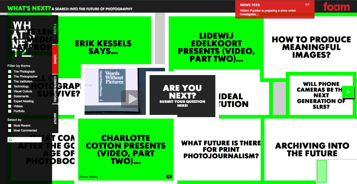
I've just written a piece for the magazine European Photography in which I touch on the lack of substantial online discussion on current trends in photography and where things are going. I'll be posting the piece on eyecurious soon, so I won't go into detail here, but in general my feeling is that although online activity on photography is growing by the day, it is becoming commensurately shallower as a result. Fortunately there are examples which buck the trend. Foam, the Amsterdam photo-museum, has recently added What's Next? to its expanding range of content. What's Next? is a supplement to Foam's quarterly magazine but also an online discussion forum which is designed to spark discussion on current trends and how they are affecting the development of photography. The museum recently organised an expert meeting in Amsterdam around the What's Next project with an impressive line-up including Charlotte Cotton, Fred Ritchin, Thomas Ruff, Joachim Schmid and many others (you can see a number of the presentations from the meeting on Foam's youtube channel). Although the design of the site messes with my eyes and head a little bit, there is some terrific content on here running from photobooks to photojournalism. As a blogger I find that the most satisfying experiences writing online are those which spark a discussion, debate or even an argument. If you are interested in any of the above, I highly recommend a visit to What's Next?
Review: Tokyo-e @ Le Bal
Le Bal's Japanese summer season continues this week with the opening of the exhibition Tokyo-e, which brings together work by Yutaka Takanashi and Keizo Kitajima with a series by an almost complete unknown photographer, Yukichi Watabe, a photojournalist who worked in Tokyo. The three groups of work on show are very different, related only through their strong connection to the Japanese capital. Although this selection seems a little arbitrary (as is almost inevitably the case with city-based shows), Tokyo-e is a rare opportunity to see an exhibition that goes beyond the ever-popular Moriyama, Araki or anything-from-Provoke choices. Tokyo-e only opens officially tomorrow, but here's a little sneak preview to whet the appetite.
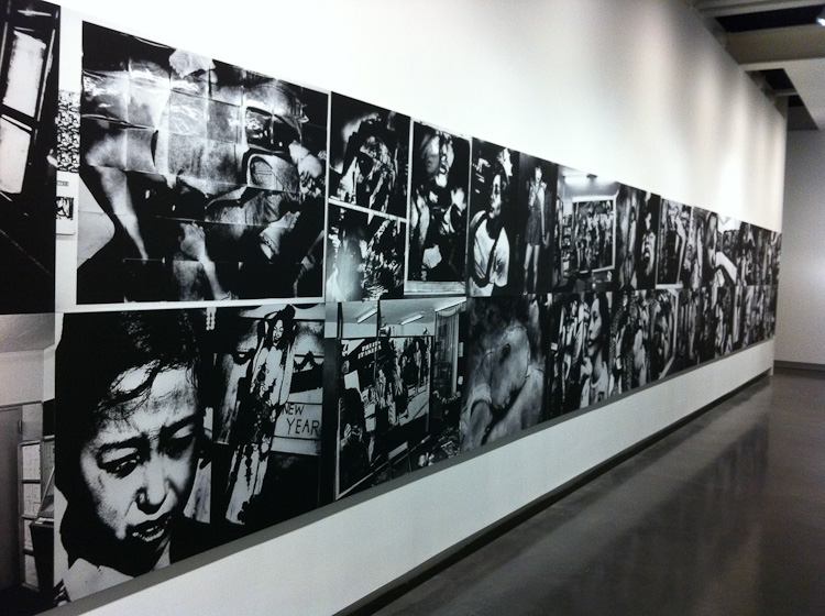
Kitajima gets the lion's share of the exhibition space with the entire downstairs floor including work spanning 15 years of his career, from his 1970s series in Tokyo and Okinawa to his work from the 1980s taken in New York, Eastern Europe, Berlin, Seoul and Beijing. The most striking feature of the Kitajima room has to be the Photo Express Tokyo grid, a band of photographs covering an entire wall. The installation is a nod to the 1970s Camp gallery where Kitajima covered the walls, floor and ceiling of this tiny Shinjuku space with his prints. In conjunction with this show, Le Bal and Steidl are releasing a facsimile of the full set of 12 Photo Express Tokyo booklets that Kitajima made in 1979 at the rate of one issue per week throughout the 12-week run of the exhibition.
Although Kitajima's work features most prominently, I found the upstairs room to be the more successful half of the show. The combination of Takanashi's Machi, a series of opulent, colour-drenched shopfronts and interiors from Tokyo's Shitamachi district, with a clever installation of Watabe's small 'film noir' vignettes creates the sense of wandering through the streets of a city from the past. The Watabe criminal investigation series is a wonderful anomaly. Shot in 1958, these photographs document a criminal investigation by the Tokyo police of a horrific murder by a suspected serial killer. In a radical departure from the straightforward 'objective' documentation that was so prevalent at the time, Watabe's photographs could be a set of film stills given how heavily they seem to be influenced by film noir, an effect which is compounded by the charismatic lead investigator, a kind of Japanese Humphrey Bogart figure. While they are different in every aspect, the installation of the two series ties them together nicely: the size of the Takanashi prints almost make it possible to walk into these city spaces, which have now all but faded away, while the labyrinthine installation of Watabe's small prints, which visitors look down on from above, echoes the detective's experience of searching for clues.
With an artist talk by Kitajima tomorrow (Friday 20 May) evening, one by Takanashi on Sunday (22 May), a film programme and a bunch of other events to come, Tokyo-e comes complete with some terrific bonus features and is definitely worth the visit.
Tokyo-e (Yutaka Takanashi, Keizo Kitajima & Yukichi Watabe), Le Bal 20 May - 21 August 2011
Rating: Recommended