Another best books of 2011 list...

I have given up, caved in, admitted defeat. Although the world does not need it, the temptation was just too great, so I have gone ahead and compiled a selection of my favourite books of the year. Instead of giving you a top 10 I decided to humbly borrow the format of the Oscars and select the best books by category (as with the Oscars, my categories are suitably ridiculous). So without further ado, I bring you the the official eyecurious Best Books of 2011.

Best really good book

Enrique Metinides, Series (Kominek)


Most unlikely best book of the year

Yukichi Watabe, A Criminal Investigation (Xavier Barral)


Best self-published book that is too big for most bookshelves

Taiyo Onorato & Nico Krebs, As long as it photographs / It must be a camera (Self-published)


Best spiral-bound book

Ricardo Cases, Paloma al Aire (Photovision)


Best sold out collectible book that gets damaged very easily

Valerio Spada, Gomorrah Girl (Cross Editions)


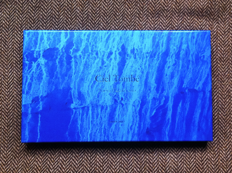
Best super-deluxe VIP book with all the trimmings

Naoya Hatakeyama, Ciel Tombé (Super Labo)


Best really weird book

Paul Kooiker, Sunday (William van Zoetendaal)


Best book cover

Takashi Homma, M2 (Gallery 360°)


Best book that I bought in 2011 but wasn't actually published this year

Tadanori Yokoo, Tokyo Y-junctions (Kokushokankokai)


Best book of outtakes

Rob Hornstra, Safety First (Self-published)


Best book of pictures made using an archaic photographic process

Christian Marclay, Cyanotypes (JRP Ringier)


Best calendar for a good cause

Yuka Amano, Seiji Kumagai, Aya Muto & Hiroshi Nomura, One Year for Japan (Lozen Up)

I will leave you with a final word of advice: the number of best books of 2011 lists that have already popped up is proof that you should NEVER publish a book in December. You'll be too late for all the best books lists and will be technically ineligible for the best books lists of the following year. You have been warned.

Cornell Capa's Peruvian suitcase

I spend quite a bit of time with photobooks, whether it be for this blog, it's slightly less wordy Tumblr cousin, or just for my personal pleasure, but it is not often that I get to spend a day with a book like this one. In fact, it is not a book but a maquette for a book that was never published. Entitled Mario, it is a children's photobook by Cornell Capa that tells the story of a young Peruvian boy named Mario. I'm not sure why it was never published but I understand that this maquette spent most of it's life sitting on a shelf and that it has only recently resurfaced. So when I was given the opportunity to borrow the book for a day, I jumped at the opportunity.

Cornell Capa is probably best known for founding the International Center of Photography in New York in 1974 and perhaps also for being Robert Capa's younger brother, but he was also a photographer and a member of Magnum Photos in his own right. His approach to photography was articulated in his 1968 book, The Concerned Photographer, which he described as a book of "images in which genuine human feeling predominates over commercial cynicism or disinterested formalism". Mario is very much in line with this philosophy.

The book is made up of approximately 60 images by Cornell Capa. The photographs are predominantly black-and-white although it also includes a handful of colour images. The photographs are accompanied by a narrative written by Sam Holmes which follows a Quechuan Indian boy named Mario who dreams of going to America where he will buy a tractor for his father. The story follows Mario from his family's simple life on the farm to his school and then on to the city of Cuzco in southeastern Peru for the Corpus Christi Festival, ending with Mario returning home. When in Cuzco, Mario happens to meet an American boy who is about the same age as him, his first encounter with the country he has been dreaming of visiting.

Although the text is clearly aimed at children, there are also some quite dense historical passages. One section deals with the richness of the ancient Inca civilization while another describes the rituals of the Corpus Christi festival. One of the most fascinating things about Mario, is that beneath the childlike language, the book has a strong political message. Returning home after his encounter with the young American during which he experiences some of the comforts of the Western consumerist lifestyle after sleeping over with his family in a hotel in Cuzco, Mario grows to appreciate the simple, ancient beauty and traditions of the rural land where he is from and his urge to travel to the city or to America fades. Today's right-wing American cable news networks would be outraged by the book's progressive, 'socialist' message.

I'm not sure exactly when the maquette for Mario was made (my guess would be in the late 1950s or 1960s), but it is an extremely interesting window onto American politics at the time and to the forthcoming interventionist American foreign policy of the 1970s. Although it is aimed at children, the book is essentially a progressive political tract... you could even go so far as to call it political propaganda.

The maquette is an interesting insight into the photobook-making process of the pre-digital era. The design is done by using a set of prints made specifically for the layout which are then stuck into the pages of the dummy book. The text is laid out in the same fashion. The design is pretty dynamic: the book doesn't follow a 'one-page-per-picture' format but plays with different formats and layouts for the images. Having spent most of its life on a shelf, the prints are in excellent condition, even those in colour. As an added bonus, I have featured more images of Mario than usual as this is not a book that you are likely to be able to get your hands on.

What makes this maquette particularly exciting is that I believe that, aside from the odd exhibition catalogue, Capa did not publish any photobooks of his work. With Horacio Fernandez's The Latin American Photobook coming out next week and Parr & Badger's The Photobook: A History Vol. 3 — with a chapter devoted to 'propaganda' — currently in the making, Mario is a timely (re)discovery.

Interview: Yannick Bouillis, Founder of Offprint Paris

Offprint Paris 2010 (© Gallery Fotohof Salzburg)

Yannick Bouillis, a former journalist and bookseller from France, is the founder of Offprint Paris, "a project space for contemporary photography and a book fair for independent publishers." He also recently organised the Amsterdam Art/Book Fair 2011 in collaboration with De Brakke Grond Amsterdam. I interviewed him over the summer to find out more about the second edition of Offprint Paris coming up in November, his thoughts on photobooks today and why the Dutch are so damn good at making photobooks.

You used to be a political journalist, how did you first become interested in photobooks?

I am not so much interested in photobooks per se. I am drawn to photobooks because the experimentation and innovation of the avant garde in photography has always taken place through publications. I came to photobooks because I realized that the place to find the most cutting edge work was not in a museum or a gallery but in the form of a publication. If tomorrow the space for formal innovation in photography becomes the exhibition then I will turn my attention to exhibitions. Today, if you want to be aware of the most interesting new trends in photography you need to be looking at photobooks or magazines, rarely at exhibitions.

Do you think the book has always played a crucial role in photography as a venue for the avant garde?

With contemporary art, there are a large number of spaces open to young or emerging artists in which to experiment. This is not the case in the photo world. With photography, from the beginning there have been a restricted number of spaces for photographers to exhibit their work and the book quickly became the primary venue for photography. As a result of this lack of spaces and the restrictions of commercial assignments, many photographers came to perceive the book as the most important output for their work. I would say this is still true today: specialists and experts who want to know what’s going on in photography still have to buy photobooks.

The focus on the so-called ‘collectible’ aspect of photobooks, which is reinforced by the endless “best photobook" awards (are there not enough competitions in daily life already?) masks the importance of the photobook within photography.

Most academics try to understand photography by importing concepts from contemporary art, where books do not play a key role, but failed obviously to understand that photography has a specific way of organising itself, generating its own validation process. The “school – gallery  – museum – art fair” sequence does not operate in photography. Even the oppositions between the ‘art’, ‘commercial’ and ‘amateur’ fields don’t operate like they do in art.

Bart Julius Peters, Hunt

Although you are French you have been based in Holland for many years. Holland seems to be punching above its weight in the photobook world in terms of inventiveness and experimentation. What do you think makes the Dutch so good at making photobooks?

I think there are two things that need to be separated out: there is the question of photography in Holland, which is very avant-gardist, daring to explore new fields and new practices like videos, installations, performances… and then there are photobooks in Holland. If there is one field where the Dutch are the best in the world, it is graphic design. While Dutch photography is generally strong, their graphic design is even stronger and this is what really makes Dutch photobooks stand out.

A photographer in Holland knows that when they start making a book, they are no longer on their own terrain, they are on the terrain of designers. Graphic design is strong and photographers also know their limits: there is a general recognition among photographers here that the standard of graphic design is so high that it makes no sense to go about trying to design a book themselves.

Uta Eisenreich, A not B

What recent photobooks have stood out for you in Holland?

I just saw the 2011 catalogue of the Arnhem Mode Biennale by Laurenz Brunner and his artistic direction is amazing. It illustrates all of the strengths of Dutch graphic design. Hunt by Bart Julius Peters is another recent discovery. The editing for this book, in collaboration with Mevis and Van Deursen, is great. Also Fake Flowers in Full Colour by Jaap Scheeren and Hans Gremmen. I also look at a lot of magazines, for example the artistic direction of Fantastic Man is pretty impressive. What interests me in these magazines is the way that they make use of photography, their irreverence for it.

Last year I would say the best book for me was A not B by Uta Eisenreich. The thing that is symbolic for me about this book is that it is representative of the transition from the artist as photographer to the artist as image-maker. This is the direction that photography has taken in Holland in the last couple of years. This is interesting for photography as art: it challenges the historical link between ‘photography’ and the ‘document’ towards non-documentary practices by people that consider themselves to be ‘photographers’. And from a commercial point of view, these image-makers is what the internet needs: more specific online esthetics that image-makers are able to provide.

"If there is one field where the Dutch are the best in the world, it is graphic design... this is what really makes Dutch photobooks stand out."

The role of design seems to be more important in Dutch photobooks in general than in other countries. It seems to be accepted that design is essential to the success of a photobook, regardless of whether a book is published by a major publisher or self-published.

In France for example, the book designer is thought of as a “maquettiste” (ed. layout guy) rather than as an artist. In Holland there are genuine ‘stars’ in the field of graphic design, the way that you get stars in fashion design or architecture. In Holland, and also in Switzerland, book design is considered to be part of the creative process rather than the production process, which is not the case in France. You can see the importance of design in Holland in the fact that some major museum directors here have been designers like Willem Sandberg at the Stedelijk Museum Amsterdam or Wim Crouwel at the Boijmans Van Beunigen. In France no graphic designer will ever become the director of the Pompidou Center.

It seems like there aren’t just one or two “super-designers” doing all the photobooks, but that there are many talented designers in Holland. What is the graphic design landscape like?

In Holland there are probably more graphic designers than photographers, there are so many of them that you trip over them in the street if you’re not careful. The country is renowned for having some of the best design schools in the world and a relatively cheap education system, which attracts a lot of foreign talent. It’s not just “Dutch” designers, but there are also a lot of foreigners who have been educated in Holland: the schools here are very international.

Jaap Scheeren, Fake Flowers in Full Colour

Is there such a thing as a Dutch design style? It strikes me that the image in Holland is less ‘sacred’ than elsewhere, there is less of a need to place a photograph in the centre of a page, framed by white space. Designers seem to have the freedom to use the images as ‘raw materials’ when making a photobook.

Dutch culture has a specific “distrust” towards images because of Protestantism and the iconoclasm (ed. destruction of religious images) of the reformation in the sixteenth century. Strangely, although portrait photography is very strong in Holland, most of the photobooks don’t feature images on the cover. This is very striking: when you buy a Dutch photobook, either there is no image on the cover, or it is a portrait from the back, or the text hides the image, etc... Basically, the cover tries to counter the “seduction” of the image… it seems like the image is an impure thing for graphic designers. The love/hate relationship to the image probably gives a special twist to Dutch photobooks in general.

But it’s also true that, in Holland, designers have a lot more control than in other countries: the cover is their cover, their moment. They are given the freedom to digest the photographs as they see fit. This can lead to the question of who the author of a photobook actually is, the photographer or the designer. For some photobooks, the translation of the works in book form is sometimes so strange and so far from the photographer’s work that the book seems to reflect the graphic designer’s creativity more than anything else.

But of course the strength of contemporary Dutch photography must also have a major role to play in the effervescence of the Dutch photobook world?

Sure. Holland has a great photographic tradition. I think the fact that the image is less sacred here gives them the freedom to be more inventive and experimental. Also there are many excellent photography schools in Holland for such a small country. And there is a pluridisciplinarity in art schools: you learn photography next to designers, graphic designers, fashion designers, videos makers etc… Many artists don’t want to stick to one medium, some would even be ashamed to be considered “only” as a photographer. Also, the definition of a ‘photographer’ is a lot more flexible and malleable than elsewhere.  That will keep them on the cutting edge for the next decade. Even in the context of a very conservative political situation, Dutch photography should remain creative for a while.

Amber, the Arnhem Mode Biennale 2011 catalogue

A few years ago, it seemed like we had come to the end of the world with photobooks and now in the last couple of years there has been a huge revival, not only in terms of the number of books being published, but also in terms of the different models of publishing (cheap limited editions, deluxe boxsets, lo-fi self-publishing, etc.)? Do you have a view on why this explosion has come about?

I think there is a reorganisation of the economic model of photobooks. Booksellers are becoming publishers. Designers are becoming booksellers. It’s a bit chaotic at the moment. Book fairs have become the new bookshop. I think this isn’t a passing trend but a fundamental business shift. Just as with galleries, most of their sales happen at art fairs, not by people walking into a gallery on their way home to pick up a photograph.

And so you have launched Offprint, the artist book fair? The first edition fair took place in Paris last year. How did you first come up with the idea?  

Initially I wanted to sell books at Paris Photo but when I saw the prices of booths I gave up on that idea pretty quickly. And then I heard about people selling books in the carpark underneath the Carrousel du Louvre… I thought about selling books from a hotel suite near the fair… In the end I got a few publishers together to sell books and that grew and grew into what ended up being Offprint.

"Today, if you want to be aware of the most interesting new trends in photography you need to be looking at photobooks or magazines, rarely at exhibitions."

So you started out by selling photobooks?

I started out collecting, after reading Martin Parr and Gerry Badger’s The Photobook: A History, Vol. 1, like a lot of people. But more so than the collecting that this book has generated (against its will), I was very interested in the way that it placed the photobook back at the center of the history of photography.

Then I become a rare book dealer, to make a living out of a passion. But I got tired of that pretty quickly because you never come across new publications, you end up selling the same few books, and get totally irritated to see every discussion starting about “architecture” but ending up about “real estate investment”. Then I came to the contemporary photobook and the artist book. And now I’m launching a publishing house and stopping my bookselling activities.

What are you going to publish?

It’s going to be focused on visual culture—design and photography books—but I also plan to publish theory and philosophy.

Self-publishing has been the big trend of the last year. Do you think it is here to stay or that it is a passing fad?

I think it is here to stay, but I’d say that it is not something people will do consistently throughout their careers. It’s something that is more appropriate when you’re launching your artistic career. Self-publishing is all about getting rid of intermediaries e.g. the publisher, the designer, the distributor.

But designing, printing, publishing, distributing, marketing, selling, shipping… having to do all of this yourself is extremely tiring. Once you have self-published a couple of books you tend to want to get other people to take some of the work off your hands. It’s like moving house… you might do it yourself once or twice, but if you have to do it regularly, after a while you get a company to do it for you. There is some space left for publishers.

There is a balance to be struck with self-publishing. Every time you cut a link out of the chain you are losing expertise and experience—and you are adding work for yourself. When you cut out the publisher for example, you are losing distribution networks, press contacts, marketing, etc. It all depends at the end on what you are willing to do and for how long.

"I am not so much afraid of the disappearance of publications, but of photographers to produce them."

To finish with an eye on the future, you've spoken about a shift from 'photography' to image-making and to specific internet-based imagery? How do you think this is going to affect the photobook?

For Offprint, the rise of the internet in both esthetic and commercial terms, raises the question of how to show emerging practices in photography, if online practices are taking over from printed ones? How can you show web activity at a fair? And if innovation is done by photographers, but not only (graphic designers, image makers, video artists), what does it mean to be a 'photographer'? What is an 'art book fair for photo publications,' if there are no 'photographers' or 'publications' anymore?

On the other hand, the photobook itself has definitively gained an 'art' status over the last few decades, alongside artist books. But art-photographers will be swallowed by the art world, by art book fairs, art museums and galleries. I am not so much afraid of the disappearance of publications, but of photographers to produce them. Or the specificity of anything called 'photography'.

Paris November photo madness round-up

Maurizio Anzeri (The Photographers' Gallery, London)

As the eyecurious faithful (and anyone who has been in Paris recently) will have noted, this has been a particularly action-packed month for photography in Paris. As I noted in a previous post, there was a bunch of different events going on at once and, as November draws to a close, I thought I would pull together a few brief impressions from the past month of photo-gluttony.

Paris Photo, the photo art fair, remains the major event on the Paris photo calendar. As with any art fair, it is not an experience for the faint-hearted or the sensitive-eyed. The fair squeezes several thousand photographs into a pretty restricted space underneath the Louvre, far more than 2 eyes and 1 brain can hope to absorb over a long weekend. Having started the week with three days of portfolio reviews at the first edition of FotoFest Paris (on which more later) it felt like a week of serious visual overindulgence.

Robert Voit (Robert Morat gallery)

A quick scan of the round-ups of the fair around the web will reveal that there is no consensus whatsoever on the highlights of the year and that is in part because it is virtually impossible to see everything. My overall impression is that this was not a particularly adventurous year in terms of new work and the focus appeared to be on bringing big name vintage work. Hamburg's Robert Morat gallery bucked that trend with a great selection of work by Robert Voit, Peter Bialobrzeski and Jessica Backhaus. There are always a couple of artists that pop up on several booths and this year Michael Wolf's Tokyo subway and Street View images and Massimo Vitali's bleached-out beaches were the two that I kept running into. As always 'curated' booths were few and far between, which is understandable given the commercial nature of the fair. However there were a couple of exceptions: for his first Paris Photo, Paris's François Sage presented (and sold all of) 20 pieces from Naoya Hatakeyama's Maquettes/Light series combined with vintage night work from Kertész, Brassaï and others; while Serge Plantureux's booth was "transformed into a detective agency" built around an extraordinary collage of every building on a 1930s St Petersburg street which spanned the full length of his booth. And a favourite discovery from last year, Maurizio Anzeri, reappeared again with some more great pieces.

Serge Plantureux's booth at Paris Photo

I suppose the natural measure of the success is sales and on this, once again, I heard wildly different assessments (Paris Photo gives it upbeat round-up here). However, for me the measure of the success of the event is its ability to bring together photographers, curators, dealers, publishers, bloggers and 40,000 other people from around the world in a single place, which, fortunately for me, happens to be where I live. On this count it feels to me that the fair continues to get more and more international each year and the best possible place to get photo projects in motion. My personal highlights included meeting the extraordinary photographer Mao Ishikawa from Okinawa and a champagne-fuelled meeting with Joakim Stromhölm (Christer Stromhölm's son) in the early hours of the morning.

(From L-to-R): Taisuke Koyama with Sawako Fukai and Shigeo Goto of G/P Gallery and artbeat publishers at Off Print

One particularly interesting development this year was the first (and hopefully not the last) edition of Off Print, a fair run in parallel to Paris Photo devoted entirely to independent photography publishing, an area that is currently seeing an explosion of activity. I was curious to see whether Off Print would be able to coexist alongside Paris Photo and pleasantly surprised to see that it more than held its own. I managed to swing by three times, always to a packed house where business seemed to be brisk. Interestingly while there was some overlap with the Paris Photo crowd, Off Print was clearly attracting a different demographic as well, a younger crowd that is perhaps more interested in the book as an object rather than just in photography itself. If evidence were needed that photobooks are alive and well, this was it.

After several failed attempts I finally managed to swing by Photo Off on Sunday afternoon to finish the week. Photo Off is essentially a more casual Paris Photo, with lower priced work by "young and emerging" photographers. From my couple of hours there I couldn't tell how successful the fair was, but it did seem a little bit strange to me that Photo Off and Off Print didn't combine forces, as I think three simultaneous event is probably a little too much to get through for collectors and as a result I expect that Photo Off didn't get the audience that it should have.

Wad of prints by Blake Andrews, Price: $9 incl. P & P & gum

On the day after the close of Paris Photo as I was trying to make some sense of everything I had seen over the course of week (and to avoid looking at a single photograph) I received a package from the US. I had completely forgotten that a couple of weeks ago I decided to rescue a group of work prints by the photographer and blogger Blake Andrews that he was threatening to abandon. I thought this was a fitting end to a week where the commercial aspect of photography can feel a little overwhelming. Not only did I get a few dozen prints for my $9, but if you look closely at the image above you'll notice that I even got a stick of gum thrown in for good measure. I doubt that any collectors got that kind of special bonus thrown in with their purchases at Paris Photo.
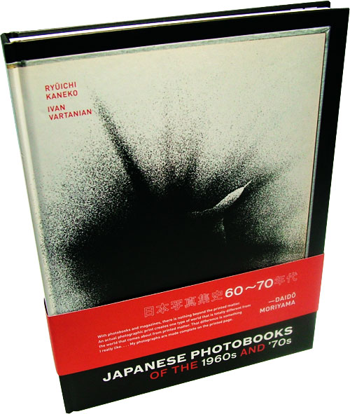
Review: Japanese photobooks of the 1960s and '70s

Japanese Photobooks of the 1960s and '70s Ivan Vartanian and Ryuichi Kaneko's Japanese photobooks of the 1960s and '70s belongs to a new breed of photobook: the book on books. Martin Parr and Gerry Badger's two-volume history of the photobook is probably the best known of these, but there are other interesting examples. Jeff Ladd's Errata Editions is taking this one step further with the 'Books on Books' series which each focus on a single photobook in order to make rare and out-of-print books accessible to us mere mortals.

Volume I of Parr & Badger already contained a chapter on the post-war Japanese photobook with a selection of some of the major books to come out of Japan in the 60s and 70s. Japanese photobooks expands on this territory over 240 pages providing a much broader selection of photobooks, including some relatively unknown ones. Some may be surprised to see a 240-page book with such a narrow focus as this, but this period of photobook production in Japan was so rich that this could have been expanded to twelve volumes and still left a lot of room for discovery.

Much of the interest in Japanese photobooks has been focused on the magazine Provoke and publications relating to it. This is the case with Parr & Badger's selection and essay which focuses heavily on Provoke. The refreshing thing about Japanese photobooks is that it doesn't just present the best-known and respected books of the period and instead includes a selection  ranging from the unavoidable Chizu (The Map) by Kikuji Kawada to a collection of anonymous student photography.

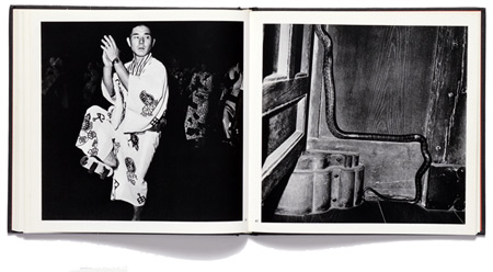
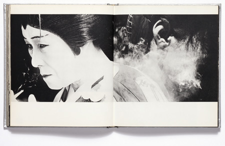
Spread from Issei Suda's "Fushi Kaden"

The book contains essays by Kaneko and Vartanian. Kaneko's essay recounts his personal journey with the photobook, a unique one since few people were buying photobooks when he did (to the point where he once ordered a book only to have the publisher turn up at his door to deliver it himself because he thought it would be cheaper than sending it in the mail). Vartanian focuses on drawing out the major characteristics and functions of photobooks and their production. I think this is one of the key strengths of Japanese photobooks and one which I would have liked to see developed even further. This kind of editorial exercise often ends up becoming focused on ranking or selecting the best books, in keeping with our ever-increasing love for the list (something I have somewhat hypocritically complained about before). This book successfully avoids the pitfalls of writing a 'best of' list, choosing instead to present a rounded picture of the many facets of Japanese photobook production of this period and to show how they relate to each other in order to provide the reader with a context for understanding what defines these books and what makes them great.

Japanese photobooks admittedly has an unfair advantage over its competition: it is drawn from the collection of Ryuichi Kaneko, which includes some 20,000 publications making Martin Parr's Japanese photobook collection look like a first-grade stamp collector's in comparison. This headstart isn't wasted and Japanese photobooks certainly uncovers its fair share of undiscovered gems. The forty or so books are presented with an extended essay and a healthy number of 'interior' shots (there is a nice preview of the book available on Vartanian's website) which successfully give a feel for each book's individual characteristics. For the geeks (and amongst photobook collectors that percentage is alarmingly high) there is also a wealth of technical information on the production process for each book (photobook porn if you will): who designed it, how it was printed and who by, where it was bound and, as a bonus, the original retail price just to make you wince when you find out how much these are worth today.

If you can't afford a photobook collection (or even if you can) this is one you really shouldn't miss.

Spread from Shomei Tomatsu's "Japan"

Ryuichi Kaneko and Ivan Vartanian, Japanese photobooks of the 1960s and '70s, (New York: Aperture, Hardcover with bellyband, 23 x 31cm, 240 pages, ca. 400 four-color and duotone images, 2009).

Rating: Highly recommended