You like this

Just as Google launches, Google+, it's latest attempt at a social network and an attempt to lure people away from Facebook, I thought I would share a piece that I have written for the latest issue of European Photography (which comes out today) that deals with the impact of blogs and social networks on the way we consume and understand photography. If you are interested in looking further into the online photography world I also recommend checking out the previous issue of European Photography (no. 88) on 'Net Photography' which investigates some of the trends in photography that is being produced specifically for and distributed through the web. Blogs have always been fragile creatures: statistics show that around 70% of them die within their first month. And now, only a decade after they first appeared, some are concerned that they are becoming an endangered species. While I am relatively new to blogging (I started eyecurious in April 2009), even in my short virtual lifetime a lot has changed. Particularly in the last year, a significant part of the online activity relating to photography has moved to online social networks such as Facebook, Twitter and Tumblr. So are we witnessing the demise of the blog? As with most of these dichotomous debates linked to technology (printed versus digital books, analog versus digital photography, etc.) I think the question is not so much whether (or when) the new will kill off the old, but rather how they are influencing each other. More specifically, what impact is the rise of social networks having on the online conversation on photography?

In a recent piece Andy Adams summarised the impact of blogs and social networks as follows, “web 2.0 is influencing contemporary photo culture around the world by connecting international audiences to art experiences, enabling the discovery of new work and presenting never-before-seen channels of expression and communication.” Blogs, webzines and now social networks have made photography far more accessible than before. We are no longer dependent on museums, galleries and books for photographic content. This not only makes it cheaper and easier to get our hands on photographs, but we can now see far more images than are available through these ‘traditional’ forms. The web makes it just as easy to access photographs being made outside our front door as on the other side of the globe, as well as work that has yet to be exhibited or published and often never will.

What truly characterises web 2.0 however is participation: the opportunity for everyone to share information and to get involved in a conversation. Although I think the internet is at its best when it creates discussion and debate, the vast majority of online activity still centres around the dissemination of information. Even within a tiny universe such as the ‘fine art photography’ (for want of a better term) community, the accessibility of the web quickly leads to an overwhelming amount of photographic content. Blogs, online magazines and increasingly social networks act as filters, allowing people to more easily find the content that most interests them. Social networks have further refined this process, not only making it easier to find the kind of photography we want, but also providing a platform on which to have a conversation around photographs. These networks create spaces for discussion around specific topics or fields of interest that just aren’t possible on the infinite plain of the broader world wide web.

So what is the downside? Most of us would agree that better access and more conversation sounds like a pretty good thing. However, while these online developments have been leading to more conversation, I would argue that they have also been making it more shallow. Take the example of Facebook. While the platform does allow for discussion, the structure of the Facebook platform is such that we are constantly being asked to like things, whether it be through ‘Fan Pages’ or simply by choosing to ‘Like’ something that someone else has posted. While I don’t think a ‘Dislike’ button would add anything to the quality of the online conversation, it would at least remind us that our reactions to photography don’t all have to be situated on scale running from good to awesome.

Twitter is a slightly different beast. With its 140-character limit, the network is intrinsically suited to point towards existing information rather than to create new content. Even in the case where a conversation develops between several users (‘tweet chats’ in the local jargon), the medium is entirely focused on immediacy and not on considered opinion. By the time you have finished reading a tweet there are already several others that have appeared in your Twitter feed demanding your attention.

The reason this matters to photography is that it can lead to a situation where we are constantly consuming and never digesting. The danger with the infinite accessibility of the web is that we can find ourselves only looking at photographs that are immediately seductive or simply popular in the networks around us. Work that might be deemed quiet, challenging or even just off-putting can get totally bypassed. Moreover, if our interaction with photography is limited to a ‘Like’ button or the 140-character equivalent, we run the risk of never getting beyond the surface of images and of not developing an understanding of why we like or dislike something. Given the demise of arts criticism in traditional media, this kind of critical thought is arguably more important than ever.

Fortunately there are many online examples that buck the trend. Blogs like Pete Brook’s Prison Photography and Beierle + Keijser’s Mrs Deane are endless sources of hidden gems and considered discussion of current photographic trends. Perhaps the two most encouraging examples are Charlotte Cotton’s 2008 Words Without Pictures and more recently, Foam’s What’s Next?, both vital spaces which use the participatory nature of the net for considered thought and conversation on what is happening in photography today and where this might be leading.

Some might argue that an overly analytical discussion of photographs can get in the way of images. But without a critical discussion, what is going to lead photography to evolve and move forward?
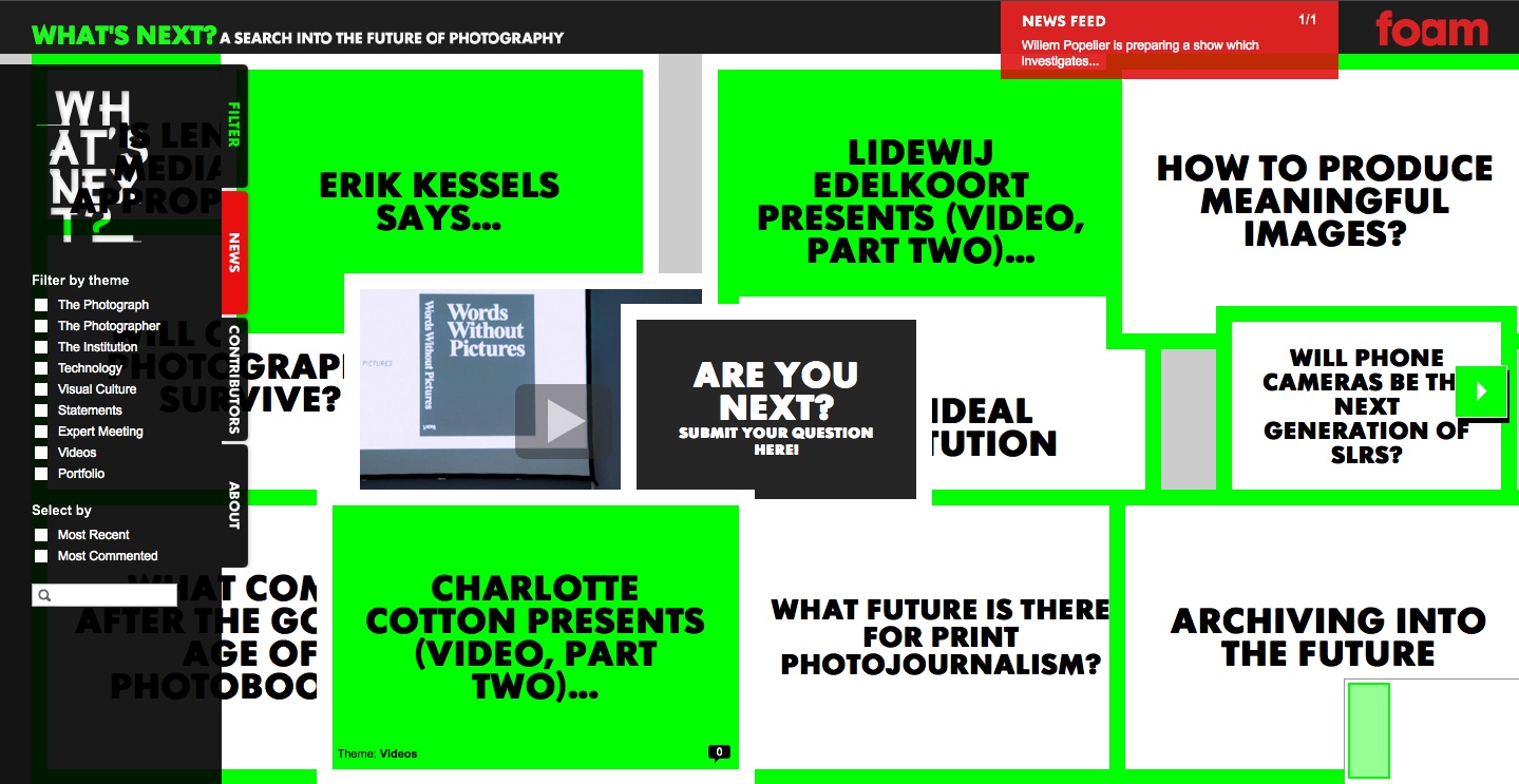
What's Next?

I've just written a piece for the magazine European Photography in which I touch on the lack of substantial online discussion on current trends in photography and where things are going. I'll be posting the piece on eyecurious soon, so I won't go into detail here, but in general my feeling is that although online activity on photography is growing by the day, it is becoming commensurately shallower as a result. Fortunately there are examples which buck the trend. Foam, the Amsterdam photo-museum, has recently added What's Next? to its expanding range of content. What's Next? is a supplement to Foam's quarterly magazine but also an online discussion forum which is designed to spark discussion on current trends and how they are affecting the development of photography. The museum recently organised an expert meeting in Amsterdam around the What's Next project with an impressive line-up including Charlotte Cotton, Fred Ritchin, Thomas Ruff, Joachim Schmid and many others (you can see a number of the presentations from the meeting on Foam's youtube channel). Although the design of the site messes with my eyes and head a little bit, there is some terrific content on here running from photobooks to photojournalism. As a blogger I find that the most satisfying experiences writing online are those which spark a discussion, debate or even an argument. If you are interested in any of the above, I highly recommend a visit to What's Next?

Interview: Joan Fontcuberta, Landscapes without memory

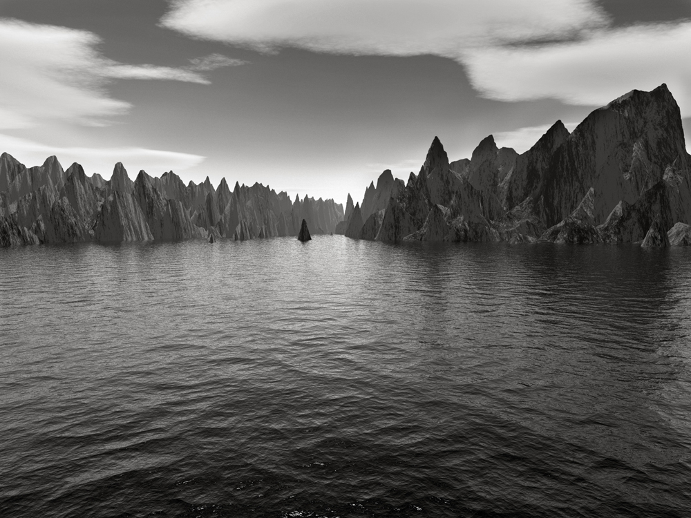
 Joan Fontcuberta, Orogenesis Pollock, 2002. I first came across Joan Fontcuberta's Orogenesis series when I picked up a copy of the Landscapes without memory book in Arles last year. The series is deceptive; these aren't photographs but computer-generated images created by software renderers that are designed to produce 3D images based on cartographical data. Fontcuberta decided to explore the possibilities of the technology by feeding it misinformation: instead of giving it a map to read, he fed it the visual data contained in famous paintings or pictures of different parts of his anatomy. The results are these "landscapes without memory."

The thing I like the most about Fontcuberta is his ability to explore philosophical questions on the nature and contemporary practice of photography while remaining engaging and frequently hilarious. I did this interview with him for the Landscapes without memory exhibition which has just opened at Foam in Amsterdam (until 27 February 2011).

Marc Feustel: How did you first encounter photography and what was it that attracted you to the medium in particular?

Joan Fontcuberta: It was in high school. Our art history teacher was a photo amateur and set up a darkroom for his pupils. The magic of photo processing immediately fascinated me. My father ran an advertising agency and I was also very curious about the world of models, photographers, filmmakers and so on. During the holidays I spent time watching and learning at the agency. Later on I joined the creative department of the agency and worked there for three years. At the same time I was studying at university: sociology, communications, semiotics… With that background what used to be an exciting passion became a more serious thing: a way to understand my physical and cultural environment.

MF: You have said that photography should not only be taught in fine art schools from an aesthetic perspective but in the context of philosophy as a tool for critical thought. In your view, is this critical thought something that is lacking in contemporary photography?

JF: I have noticed a perverse phenomenon in contemporary art: artists abdicate their discourse to critics and curators. Their work then just becomes an illustration of someone else’s discourse. Maybe that is the price they have to pay to achieve some form of recognition in the art scene or market. Luckily there are exceptions. Presently I am very curious about ‘found’ and ‘trash’ photography and could mention the names of Joachim Schmid, Penelope Umbrico and Erik Kessels. There are many other intelligent, radical voices in other approaches as well… I am optimistic. Regarding critical thought, Marcel Proust said: “Le véritable voyage de découverte ne consiste pas à chercher de nouveaux paysages, mais à avoir de nouveaux yeux.” (“The true voyage of discovery does not consist of searching for new landscapes, but of having a new pair of eyes.”

Joan Fontcuberta, Orogenesis Derain, 2004.

MF: The images in Landscapes without memory are created by using three-dimensional imaging software designed to render landscapes based on maps. Can you explain a little about the process for making these images and how you discovered the software that you used to make them?

JF: I used several 3D renderers (if you search Google you will find dozens of them). I discovered them in the Banff Center for the Arts, in Canada, in 1994, where I was invited to lead an art residency on the concept of “The Transient Image”: an international gathering of visual artists exploring the mutations of technological image making. There I learned about virtual reality technologies and became fascinated by the possibilities they offer to build illusionary spaces. It was an ironic paradox that a center located in a national park in the Rocky Mountains, surrounded by such magnificent virginal nature, went to that much effort creating virtual models of invented nature. In any case, all this software functions on the same principle: cartographic data is translated into a 3D relief. However, I deceived the computer and instead of inputting a map, I input a masterpiece of landscape painting or photography. The software is constrained to output a landscape, whatever the input. It must produce an image within a vocabulary of limited terms: mountains, volcanos, valleys, rivers, oceans… And this is the point: a landscape is recycled into another landscape. This subversion unveils another gesture: we make computers to produce hallucinations, we push technology to let its own unconscious emerge.

MF: Since the New Topographics, landscape photography has occupied a growing space in the world of fine art photography. But contemporary landscape photography seldom depicts the beauty of 'natural' landscapes, like the work of Ansel Adams for example. Is there still a place for photography that celebrates the beauty of the natural landscape?

JF: This is a debate about beauty within aesthetic categories. Of course there is a place to celebrate the beauty of the natural landscape—as currently happens in postcards and calendar plates. The question is which kind of beauty are we interested in? Should art just provide visual pleasure or should it rub our eyes with sandpaper to disturb our conscious and provoke a reaction? The philosopher Eugenio Trías believes that the sublime substituted beauty, and that the sinister has then substituted the sublime. This notion of sinister derives from Freud’s “Umheimlich” and refers to a sense of distortion and oddity. I wonder if we are now experiencing a mutation towards a new, hybrid category. I have in mind a sentence by Picasso: “The ugly may be good; the beautiful will never be”. He meant that something considered beautiful conforms to a standard taste, whereas something considered as ugly may confront our present sensibility and bring out a new one.

Joan Fontcuberta, Orogenesis Turner, 2003.

MF: Contemporary landscape photography often focuses on the tension between man and nature. However what we are seeing in this series appears to be ‘pure’ nature, with no trace of man whatsoever, and yet these images are entirely artificial, a man-made fantasization of nature. How did you develop the approach to this series?

JF: Many of my projects deal with landscape, or how landscape should be understood today. For instance, in Securitas I borrow keys from people and project them onto photographic paper. The result is a horizontal line simulating a mountain ridge. It is a minimalist idea which epitomizes the essence of landscape as related to safety and property. Thus landscape can be defined by ideological and political approaches, rather than aesthetic ones based on a resemblance to nature.

Now let’s go back to the roots of landscape as an autonomous genre. Until the seventeenth century, natural space was just a subordinate background for portraits or historical scenes. The birth of landscape inverted the established visual order of things, giving priority to that which had been traditionally considered merely as escenography. Landscape painting has only been recognized quite recently, when artists achieved the right to contemplate nature without the justification of human anecdotes. To contemplate nature without, let’s say, being seen. In my Orogenesis landscapes nobody looks at us, they are brand new and consequently exempt of human experience. On the other hand, they constitute a sort of postmodern statement: they illustrate that the representation of nature no longer depends on the direct experience of reality, but on the interpretation of previous images, on representations that already exist. Reality does not precede our experience, but instead it results from intellectual construction.

An additional concern in Orogenesis is artificiality and more precisely artificial nature. Let’s ask ourselves the question: could a natural nature exist? The answer is no, or at least, not anymore: man’s presence makes nature artificial. Until the sixth day, Creation was natural, but at the seventh it turned into an artifice.

MF: With the proliferation of digital technology, more still photographs are being made than ever before, despite advances in other media like video. Do you think that people would still be as attached to photography if it were no longer perceived as a document of reality?

JF: Yes, certainly. Photography is dissolving into the magma of images. It is losing its historical specificity, but is beginning to fulfil other functions. I just published a book titled Through the Looking Glass about cell phone photos and their circulation through the Internet and online social networks. Teenagers are not interested in photographs as documents but as trophies. When Martians finally invade the Earth, green lizard-shaped aliens will emerge from their spacecrafts. They will fire at us with laser guns but we won’t hide nor protect ourselves. We’ll take our cell phones and we’ll photograph them to prove that we saw them, to prove that we were there when they arrived.

Joan Fontcuberta, Orogenesis Weston, 2004.

MF: Interestingly all the images in Orogenesis depict incredibly dramatic, over-the-top landscapes. Is the software capable of depicting an unremarkable landscape, like an empty field or a barren wasteland?

JF: Sure. However if you keep the default settings the software is endowed with an unconscious model oriented towards spectacular landscapes, something that should make us reflect on its inherent ideology. There is a glorification of the mountains as symbols of spiritual achievement and purification. I exaggerate that feeling because the resulting wild and imposing landscapes must be read as a parody. Somehow that excessive sense of drama leads to a sense of kitsch, or is reminiscent of the ahistorical landscapes of computer games through which players travel in search of predetermined adventures.

MF: Can you explain a little about the significance of the title ‘Landscapes without memory’ and the absence of memory in these landscapes?

JF: There has been a common strategy in contemporary art focusing on landscape as depictions of territories where a tragic event occurred in the past. The place is presented metonymically as a remnant of the event itself, it wouldn’t interest us without the history behind it. So usually landscapes exist because they hold those layers of memory. However, Orogenesis displays landscapes beyond the influence of time, frozen in an uncertain geological age, without any trace of culture or civilization. There is no echo in them, no voices or shouting that have vanished into the continuity of life and oblivion. There is nothing to commemorate there, nothing to remember. A kind of ‘degree zero’ terrain. Thus, they are landscapes without memory—well, with the exception of the memory of art.

MF: Humour is less obviously present in this series, but in general it appears to be an important aspect of your work. What role does it play in your photographic practice?

JF: Let’s go back to classics: “Castigat ridendo mores” (“One corrects customs by laughing at them”): that was the Latin motto for comedy. I belong to a Mediterranean hedonist sensibility—which might be the contrary of a Calvinist one. There is an illustrative folk saying: “Good girls go to Heaven; bad girls go to everywhere”. Humour is not only an ingredient to enjoy life, on the same level as good weather, wine, sex and fiesta as the cliché goes. A great deal of contemporary art is too solemn and boring. In my work humour is like a filter trying to put forward serious proposals but in an appealing and exciting manner. Laughter is a revolutionary impulse, the great antidote to the poisons of the spirit. As Nietzsche said: “We should consider every day lost on which we have not danced at least once. And we should call every truth false which was not accompanied by at least one laugh”.

Paris in Amsterdam

_MG_7730_9

I have just written a piece on Michael Wolf's Paris Street View for edition 22, Peeping, of the excellent Foam Magazine run by the Amsterdam museum of the same name. The museum got as excited as I did about this new series and decided to go the extra mile by putting up an outdoor installation of 24 XXL prints from Paris Street View in Amsterdam's Zuidas area (on the street where Google has its Dutch office) which is in the process of being redeveloped. I made the trip up for the launch and to find out a bit more about the Amsterdam photo scene.

The Paris Street View installation is very impressive (which this terrible installation view taken with my phone camera does not do justice to at all) and the work takes on an added dimension when displayed in amongst the city, rather than just on the neutral white walls of a gallery or museum. Wolf likened it to a "monument to privacy lost" and these massive figures dotted around this modern urban landscape also create an interesting warped sense of scale, making the buildings in the background look like scale models. It will be interesting to see how people in the area react to the works over time and whether the work can provoke some further debate over these issues. (Update: Michael Wolf just kindly sent me some proper installation views so I have uploaded one of these instead).

I also swung by Foam itself. For a museum that only opened in December 2001 in a small European country, Foam cuts an impressive figure on the European photo scene. The venue is not huge, but they use the space intelligently and a look at their programme schedule shows their ability to combine crowd-pleasing fare with 'important' exhibitions.

Ari Marcopoulos

The current programme is a great illustration of this as the ground floor is occupied by Amsterdam-born photographer and filmmaker, Ari Marcopoulos who has photographed street culture for several years on both US coasts. Although much of the photography in this exhibition left me cold, I was more interested in Marcopoulos's large-scale xerox prints which reveal the influence of Andy Warhol, for whom he was a darkroom printer. But the highlight of It might seem familiar has to be a 10-minute video of Marcopoulos and an accomplice skating down a very steep road in California wearing matching pastel blue suits. This is far more exhilarating and revealing of the culture that Marcopoulos has spent 30 years documenting.

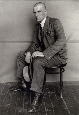
Alexander Rodchenko, The poet Vladimir Mayakovsky

The upper floor is devoted to an exhibition of vintage work by the Russian avant-garde artist, Alexander Rodchenko, which was first held at London's Hayward Gallery in 2008. This is a very complete look at the photographer's extraordinarily inventive and experimental career, from his early use of photography in graphic design in the 1920s to his later work on human movement. Every section of this show contains masterpieces, whether it be the early magazine covers, photograms or photomontages, the portraits or the later work on movement. The prints are all vintage and with a significant number coming from private collections this is a pretty unique opportunity to see this many quality Rodchenko's in one place.

Between Paris Street View, the Rodchenko exhibit and the city of Amsterdam itself, there are more than enough reasons to make a visit.