 "Postmodern interjection, intervention, and manipulation practiced by the society at large have made the image evident more as an artifice than a true recital of the outside world. That makes me happy." Allan Chasanoff
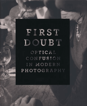
This quote gives you an idea of the thread that runs through First Doubt, Optical Confusion in Modern Photography, an exhibition held at the Yale University Arts Gallery from October 2008 until January 2009. I didn't make it to New Haven to see the show, but Joshua Chang sent me a copy of the catalogue for helping out with a Tomatsu image, and it has since become one of my favourite photo-books of 2008.
The exhibition was based on the collection donated to Yale by Chasanoff and it covers some pretty diverse territory: portraits, abstracts, landscapes, street photography, and more, from early twentieth century to the mid-1990s. The work is mainly American (many of the big names are present: Ansel Adams, Walker Evans, André Kertész, William Klein), but there is also a healthy representation of Japanese material (Naoya Hatakeyama, Ryuji Miyamoto, Tomio Sieke, Isami Shiroma, Shomei Tomatsu, and Shikanosuke Yagaki).
One of the classic images of postwar Japanese photography is on show here, Tomatsu's Beer Bottle After the Atomic Explosion. A friend of mine wrote her PhD thesis on the differences between Domon Ken and Shomei Tomatsu's photographs of the bombings of Hiroshima and Nagasaki respectively. I have to admit that I didn't make it through all 200 pages, but I completely agree with her basic premise. Domon's images of Hiroshima survivors, particularly of skin transplant operations, were so brutally direct, that they become almost impossible to look at. There is no doubt that the horror of the bombings is conveyed, but they leave me no time to digest their meaning. Tomatsu's treatment on the other hand was indirect, using symbolism to evoke the bombings and the horror of their impact. As you are drawn in to the photographs to decipher what is happening, the space that this creates gives more time for the image to settle and to resonate. Tomatsu's Beer Bottle is the perfect example of that, and for me it is infinitely more powerful and permanent than any of the most brutally direct images of the human and physical devastation of the aftermath of Hiroshima.
What ties the images in First Doubt together is Chasanoff's remarkable eye for the optically confusing image. These are not immediately 'legible' photographs, they all require some mental gymnastics before you can figure out what is going on. Despite the diversity of the material, there is a remarkable coherence here that comes from the resonance between the images. This is one of the strongest overviews I have seen of the optical experimentation in twentieth century photography, and for all the analog purists out there, a testament to how much can be done with a camera and some light.
The book design and typesetting is appropriately clean and simple, given the complexity of these images, and it is beautifully printed (in Connecticut!). The texts by Stephen Zucker and Joshua Chang are both good, and I particularly enjoyed Chasanoff's text, which gives an insight into the incredibly inquisitive and provocative mind of the man who put this collection together.
Rating: Highly recommended
First Doubt, Optical Confusion in Modern Photography (New Haven: Yale University Art Gallery, 2008, hardcover, 220 pages, 94 colour and mononchrome plates).

