As soon as I heard the name of Andrew Phelps's latest book I was intrigued. Niigata is not the most obvious prefecture in Japan for a foreign photographer to choose as a photographic subject (Tokyo's magnetic pull certainly doesn't seem to be weakening). I was all the more interested as Niigata is an area of some importance in Japanese photographic history. One of the most important series of the postwar years, Yukiguni (Snow Land), was shot in Niigata by Hiroshi Hamaya. Hamaya was deeply interested in Japanese folklore and he chose Niigata as a photographic destination because of the many folk traditions and rituals that remained intact and revealed a 'traditional' Japanese way of life during a deeply troubled period where American occupation filled the vacuum left by years of militarism.
Phelps's Not Niigata is part of the European Eyes on Japan project that has been running every year since 1999 and which invites photographers who are working in Europe to "record for posterity images of the various prefectures of Japan on the theme of contemporary Japanese people and how they live their lives." This always seemed like an interesting photographic exercise to me, but after seeing some of the results in previous years it became clear how difficult it is. The participating photographers often only have a couple of weeks to photograph a specific region, which isn't a lot of time to try and get your bearings and come to terms with how things work in a country that is pretty radically different to Europe. One of the great strengths of Not Niigata is the fact that this difficulty is acknowledged from the outset. In his short introduction, Phelps writes:
"My way of working is a bit like making a poodle or a swan out of a shrub. Small bits of the mess are snipped away until some sort of form starts to take shape. (...) In the end if all goes well, I end up with something that may slightly resemble a poodle or a swan. But it's definitely neither a poodle or a swan and it's definitely not Niigata."
In some ways this project feels more like it is about the experience of going to a very foreign place for a very short time and trying to document ("for posterity") contemporary life, than it is about Niigata specifically. Phelps is very aware of this delicate position, as is obvious from the title of the book and even in the cover image, where a scene from Niigata is reflected with slight distortions on a pond or canal. This probably isn't the right comparison to make, but it reminded me in some ways of the film Lost in Translation, which isn't really about contemporary Japan, but about the feeling of being lost in a totally alien environment. I found that Phelps made subtle references to his position as a foreign photographer in some of these images, such as in this image of four children peering up at the strange gaijin who is taking their picture.
Phelps also successfully avoids reproducing exotic visual clichés of Japan or the Far East. In one image, he has photographed a tree that could have been silhouetted against the sky to produce an image that conforms to our vision of 'oriental' beauty. Instead Phelps has photographed the whole tree in a straightforward way and in the bottom right of the image he has left in a lamp post with two red spot lights on it.
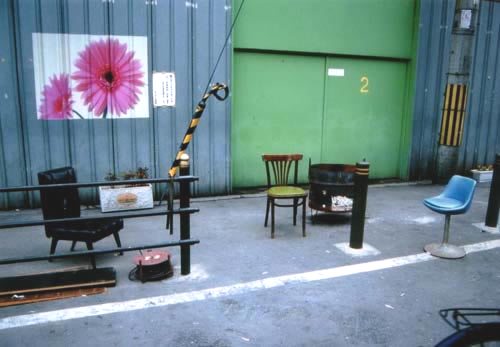
He doesn't run away from the 'traditional' either: urban scenes that could well have been taken in Tokyo sit alongside images of two women dressed for a rice harvest festival or of an old woman sitting on a tatami mat in a traditional Japanese house. The overall picture that emerges from the picture is nuanced: we are shown old people, presumably in those rural areas that have been almost entirely abandoned by the young generation, and the young who hang out in modern cities that look like they could be anywhere in Japan. Natural beauty rubs up against modern anonymity and a certain sense of dilapidation. This Niigata does not feel like it has a bright future, but more like a place in limbo.
There are some great, understated, but astute images in this book. I found some of the portraits and the images of the more 'traditional' aspects of life in Niigata to be slightly less interesting. Overall I was left with a slight feeling of dissatisfaction, as I think Not Niigata would have been more successful if Phelps had developed more on this sense of displacement and alienation. But then I suppose that wouldn't be sticking to the script of the European Eyes on Japan project. Phelps feels like a very intelligent and thoughtful photographer and I look forward to seeing what his next project will be.
Not Niigata (Heidelberg: Kehrer Verlag, 36 colour plates, hardcover, limited edition of 888 copies, 2009).
Rating: Recommended


