Cornell Capa's Peruvian suitcase

I spend quite a bit of time with photobooks, whether it be for this blog, it's slightly less wordy Tumblr cousin, or just for my personal pleasure, but it is not often that I get to spend a day with a book like this one. In fact, it is not a book but a maquette for a book that was never published. Entitled Mario, it is a children's photobook by Cornell Capa that tells the story of a young Peruvian boy named Mario. I'm not sure why it was never published but I understand that this maquette spent most of it's life sitting on a shelf and that it has only recently resurfaced. So when I was given the opportunity to borrow the book for a day, I jumped at the opportunity.

Cornell Capa is probably best known for founding the International Center of Photography in New York in 1974 and perhaps also for being Robert Capa's younger brother, but he was also a photographer and a member of Magnum Photos in his own right. His approach to photography was articulated in his 1968 book, The Concerned Photographer, which he described as a book of "images in which genuine human feeling predominates over commercial cynicism or disinterested formalism". Mario is very much in line with this philosophy.

The book is made up of approximately 60 images by Cornell Capa. The photographs are predominantly black-and-white although it also includes a handful of colour images. The photographs are accompanied by a narrative written by Sam Holmes which follows a Quechuan Indian boy named Mario who dreams of going to America where he will buy a tractor for his father. The story follows Mario from his family's simple life on the farm to his school and then on to the city of Cuzco in southeastern Peru for the Corpus Christi Festival, ending with Mario returning home. When in Cuzco, Mario happens to meet an American boy who is about the same age as him, his first encounter with the country he has been dreaming of visiting.

Although the text is clearly aimed at children, there are also some quite dense historical passages. One section deals with the richness of the ancient Inca civilization while another describes the rituals of the Corpus Christi festival. One of the most fascinating things about Mario, is that beneath the childlike language, the book has a strong political message. Returning home after his encounter with the young American during which he experiences some of the comforts of the Western consumerist lifestyle after sleeping over with his family in a hotel in Cuzco, Mario grows to appreciate the simple, ancient beauty and traditions of the rural land where he is from and his urge to travel to the city or to America fades. Today's right-wing American cable news networks would be outraged by the book's progressive, 'socialist' message.

I'm not sure exactly when the maquette for Mario was made (my guess would be in the late 1950s or 1960s), but it is an extremely interesting window onto American politics at the time and to the forthcoming interventionist American foreign policy of the 1970s. Although it is aimed at children, the book is essentially a progressive political tract... you could even go so far as to call it political propaganda.

The maquette is an interesting insight into the photobook-making process of the pre-digital era. The design is done by using a set of prints made specifically for the layout which are then stuck into the pages of the dummy book. The text is laid out in the same fashion. The design is pretty dynamic: the book doesn't follow a 'one-page-per-picture' format but plays with different formats and layouts for the images. Having spent most of its life on a shelf, the prints are in excellent condition, even those in colour. As an added bonus, I have featured more images of Mario than usual as this is not a book that you are likely to be able to get your hands on.

What makes this maquette particularly exciting is that I believe that, aside from the odd exhibition catalogue, Capa did not publish any photobooks of his work. With Horacio Fernandez's The Latin American Photobook coming out next week and Parr & Badger's The Photobook: A History Vol. 3 — with a chapter devoted to 'propaganda' — currently in the making, Mario is a timely (re)discovery.

Review: Cary Markerink, Memory Traces

I should start by saying that this review is long overdue. This is partly due to the fact that my blogging activity has ground to a halt of late, but also because of Memory Traces itself. The book is an intimidating object consisting of one oversized (30.5 x 41 cm) volume weighing in at a hefty 202 pages accompanied by two smaller books, ‘Höffding Step’ and ‘Dark Star’, inset into a custom cardboard case. Memory Traces is not only intimidating but unwieldy. This is not a book that can be casually flicked through: it requires space (if only to support its weight and size) and time to get through its complex layout made up of gatefolds and double-gatefolds of different sizes. Its three-book structure is also complex and of course there is no easy instruction manual provided to tell you how to get started. However, while these first observations may come across as criticisms, it is precisely because Memory Traces is such a difficult book that it is so unique.

The central book in the trilogy consists of a series of large format landscape photographs that were made in Sarajevo; Hiroshima and Nagasaki; Berlin, Bitterfeld-Wolfen and Ronneburg; Bikini Island and Nam Island; Chernobyl; Khe San and My Lai. These images all depict places that have been deeply affected by recent man-made conflicts or disasters. However, Markerink's images are far removed from the inflated drama of what has become known as 'ruin porn'. His photographs of Sarajevo, My Lai or Chernobyl reveal places that seem to be defined by the scars of their past. As the Japanese photographer Shomei Tomatsu said of Nagasaki, these are places where it seems as if "time has stopped". Memory Traces also depicts landscapes, such as those of Hiroshima or Berlin, that show few visible signs of past traumatic events. Although these cities are still defined in many ways by their history, their landscapes are in the process of being radically transformed by the objectives of economic growth.

You could say that Memory Traces deals with the different ways that history manifests itself within the landscape. However, it is as concerned with the present and the future as with the past. One of the most remarkable things about the imagery in this book is its treatment of time: the locations that Markerink has photographed all have troubling pasts, but these images do not give the sense of looking back. Instead they raise questions of how the past is carried forward and transformed as time passes. Although it is made up entirely of landscape photographs, this is fundamentally a book of big ideas. Markerink is not interested in the formal aspects of landscape, but rather in how landscape acts as a mirror for culture, for society in general. In 'Höffding Step', a book of text combining travel diaries, reflections on contemporary culture with Markerink's views on the changing nature of photography, Memory Traces reveals itself to have even greater and broader aspirations.

With Memory Traces, Markerink has created an object that is designed to create the space for us to stop and think, a space that is essential when dealing with such ambitious subjects. Everything about the way it is made — the book's huge size, its use of gatefolds, etc. — seems to be designed to slow down the reading process as much as possible. This is a book that also made me think about the way that we read photobooks. To use Markerink's own description, Memory Traces is an "experience" with many entry and exit points rather than a book that can simply be read from start to finish.

If all of this sounds a little lofty, that is because it is: I doubt that you will ever come across a more ambitious photobook. It is a project that Markerink worked on for over 10 years, one which he describes as a gift he decided to make to himself for his 50th birthday "as a means to come to terms with (his) culture and (his) position within it." It is a book that swims directly against the current of these times in which images are made, distributed and consumed and discarded in a matter of seconds. It will most likely bewilder you, frustrate you, confuse you and probably keep you coming back for more. Like Terence Malick's Tree of Life, it is not without its flaws, but it is rare to come across projects that are this outrageously ambitious and for that alone Memory Traces is worth seeking out.

Cary Markerink, Memory Traces. Ideas on Paper (self-pub., clothbound hardcover, 30.5 x 41 cm, 202 pages together with two small booklets, 'Höffding Step' and 'Dark Star' 12 x 16 cm in a printed box, 2009).

Rating: Highly Recommended

Review: Valerio Spada, Gomorrah Girl

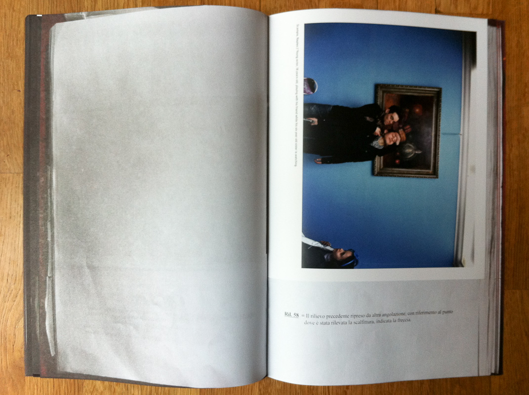
Valerio Spada, Gomorrah Girl I caught up with Valerio Spada after missing the book launch of Gomorrah Girl at Le Bal in Paris in early March. The tallest Italian I have ever met, his enthusiasm and heart-on-his-sleeve sincerity are infectious and endearing (check out his Tumblr for a nice example of this). Spada explained how Gomorrah Girl had initially come about as a shoot on adolescence in Naples, during which he had discovered the story of Annalisa Durante, a 14 year-old girl who was killed, shot in the head by a stray bullet in an assassination attempt, as she was talking to a young Camorra mobster. It was when Spada heard Annalisa's story from her father Giovanni Durante, that he realised that he had found the heart of his project. After the excellent film, Gomorrah by Matteo Garrone (based on the Roberto Saviano novel), Spada's book also focuses on adolescence but more specifically on the plight of the teenage girls living in this fiercely masculine world.

Hearing Spada talk about this book it is clear that after discovering the story of Annalisa, she became a constant presence that accompanied him in the background to every one of his shoots in the city. What I found ingenious in Gomorrah Girl is that it succeeds in translating this duality into the form of the book. It is essentially two intertwined books, the first simply presenting straight photographs of the police report on Annalisa's shooting and the second containing Spada's photographs of different aspects of the city's adolescent life. By interweaving these two books page by page, Annalisa's story, as embodied by the police report on her accidental murder, becomes a constant backdrop to the portraits of the young girls that make up the second book. This structure gives the book a certain ominous feeling, as if Annalisa's fate is hanging over each of the girls pictured in the book and could become theirs at any moment. The design by Sybren Kuiper (what is it with the Dutch photobook mafia?!?!) is intelligent and turns this otherwise straightforward documentary project, into something more interesting and multi-layered.

In a way, what I enjoyed most about the book is the way the object is so important in telling the story. Another example of the intelligence of the design is that, in addition to the two-book structure, the paper used for the police report section of the book is very flimsy, and, if you spend enough time with Gomorrah Girl, it's likely that its pages will resemble those of the police report that it depicts. Although Spada's portraits of Neapolitan adolescents are quite strong, I found myself wanting a more in-depth into their world rather than just a glimpse of each of their individual stories. I found that the book fell a little short of presenting a more complex and developed picture of the world in which these adolescents live. There are some fascinating threads to follow however, such as the neomelodico girls, which would be worthy of a book project in itself. In one caption Spada explains that the neomelodico "can make up to 200,000 euros per year for singing at weddings and other various ceremonies ... Through some of these songs and ceremonies the Camorra families send messages to each other." In a portrait of one of these young singers, tears roll down the girl's face but her expression betrays no emotion... if anything her face shows how hard she has had to become to live in the world that surrounds her.

Valerio Spada. Gomorrah Girl. Cross Editions (self-pub., soft cover, 40 + 40 pages, colour plates, 2011). Limited edition of 500 copies.

Rating: Recommended

Review: Inger Lise Rasmussen, Brilliant City

Inger Lise Rasmussen, Brilliant City When I met Inger Lise Rasmussen at the Fotofest Paris portfolio review last November, one of the first things she said to me was "I'm not a photographer, I'm a print-maker." This distinction is worth keeping in mind when looking at her work. Going through her portfolio at the time, it was clear to me that each of her prints should be considered as objects rather than just as images. She makes her prints using a photo-gravure process and her background as a graphic artist comes through clearly in her compositions of multiple images on a single sheet of the rich, textured papers which she uses. I found the results to be quietly beautiful and very different to the other work which I reviewed at the time.

Given the importance of the print-making process to Rasmussen, I was curious how her work would translate into book form, particularly into the form of a fairly straightforward exhibition catalogue such as this one. Although I think she is being a little hard on her herself (and more than a little tongue-in-cheek) when she says "I'm not a photographer," I do think that her pictures are more interesting as graphic elements with a very particular atmosphere and texture than as photographic images.

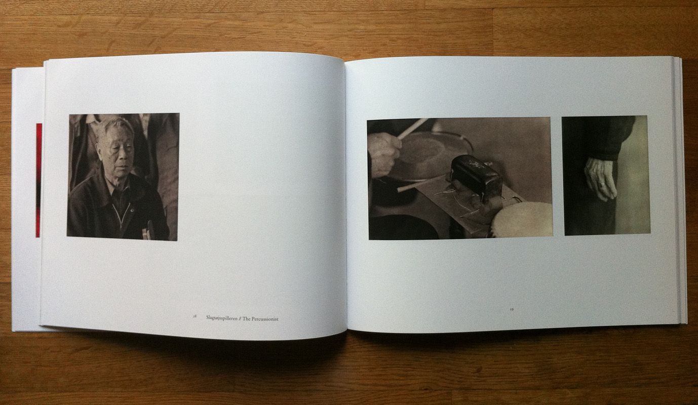
In 2007 and 2008 Rasmussen made two trips to China to study the country's exploding urban growth in the cities of Beijing, Xian, Wuhan, Chongqing and Shanghai. The resulting collection, Brilliant City, is not broken down into separate sections for each city, but structured as a series of small chapters on different characteristic aspects of urban China. These fragments go from the 'big picture' of the cities' structures (old hutong neighbourhoods being torn down, cityscapes of new neighbourhoods of huge residential blocks) to the more detailed and human (a group of grasshopper collectors, a metal worker, a percussionist). Unfortunately, I found that the book suffered a bit from this fragmented structure: it felt like the series of vignettes that it contains didn't quite add up to a coherent or complex impression of the China's emerging mega-cities. Although the book is well printed, having seen Rasmussen's prints, I don't think the book quite manages to replicate the richness of the gravure tones and texture of her prints.

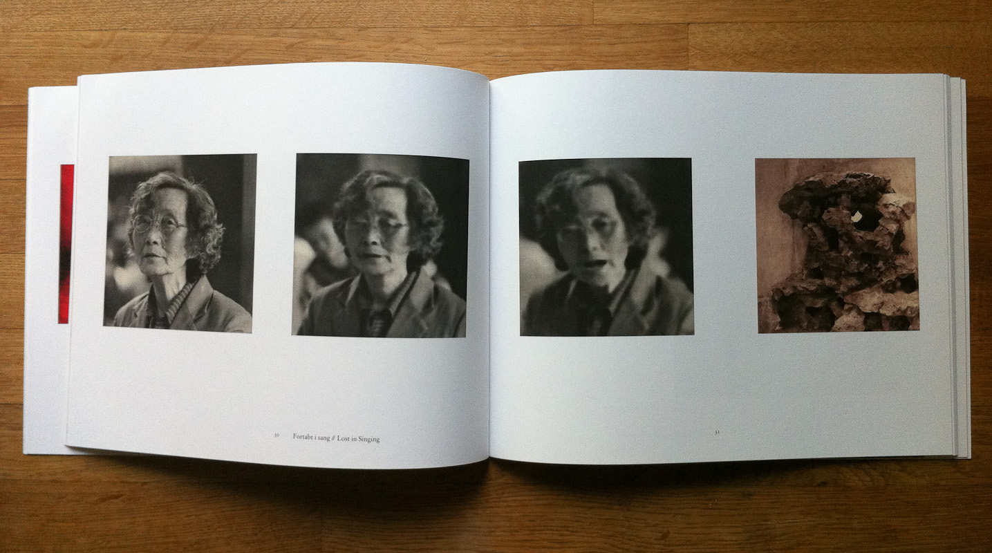
Brilliant City is at it's best when the pages of the book echo the graphic compositions of Rasmussen's prints. Her gravure technique is also better suited to the more intimate images (grasshopper collectors, a lone percussionist) than the sprawling cityscapes. In a chapter entitled 'Lost in Singing', an old woman singing fades gradually out of focus across a series of three images punctuated by a fourth image of an ancient stone, a sequence which manages to be both poetic and, frankly, strange.

What I enjoyed most about Brilliant City was seeing one of the hottest subjects in contemporary photography (urban growth in China) treated in a very different way from the many large-format formal studies that have appeared in recent years. Although Rasmussen uses old, some might even say antiquated, techniques this gives her work a more lyrical sensibility without misleading the viewer into thinking that these are images of the past. There is still a strong sense of this being China now. Although some of the subjects felt a little too obvious (the fading lanterns or the building sites), the book doesn't fall into the trap of romanticising the past and criticising it's modern replacement. It feels more like a slightly melancholy acceptance of the fact that China is undergoing a radical transformation, for better or for worse.

Inger Lise Rasmussen, Brilliant City. Aarhus Kunstbygning (Soft cover, 63 pages, black-and-white and colour plates, 2009).

Rating: Worth a look

Review: Adriaan van der Ploeg, Mont Purgatoire

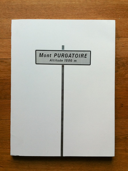
After Mariken Wessels' two mysterious tomes (one of which was reviewed here) which seemed to make most 'best of 2010' photobook lists, our Dutch friends have done it again and produced a book which really should not exist. I couldn't help but try to imagine this book idea being pitched to any halfway-sane book publisher, "I want to do a big, 150-page book of portraits of out-of-shape, middle-aged men who try to cycle up this mountain that most people have never heard of, but which has a cool name. The portraits will all be taken from the same head-on perspective with some kind of telephoto lens, they'll be tightly cropped and really flat and even out of focus sometimes because they're cycling up a mountain and the guys will all be sweating and in varying degrees of pain. Oh and as a bonus feature, I'll throw in a promotional website with a background video of one of the cyclists throwing up on the side of the road while some other guys ride past him." 99% of the time he would literally be escorted out of the building, possibly with a restraining order thrown in for good measure, and yet the good people of Habbekrats decided that there was some part of this project that was actually a good idea. The funny thing is that they were right.

There is nothing about this book that should interest me. I'm all for the odd bike ride but serious cycling leaves me cold... sweaty middle-aged men trying to reach their physical limits leaves me even colder. And yet, I was drawn in. Like it's non-illustrated cousins, 2008's Netherland about New York cricketers and current favourite The Hare with Amber Eyes (a 350-page book written about a collection of Japanese netsuke, tiny bone or ivory sculptures), Mont Purgatoire is not really about its (not particularly sexy) subject. Although the book comes with a number of essays written by cyclists, cycling poets and sports writers, the photographs it contains provide no context of the gruelling cycle that these men undertake to make it to the top of this mountain. For all we know, Van der Ploeg never even went near the place. I don't think it's going to reach quite the same sales figures as its fictional cousins, but what I found interesting is the way that it goes beyond its apparent subject to become a kind of study of the way we express feeling. Thumbing through its pages, you can't help but wonder what is going through these men's minds and why they are attempting this punishing climb. Their expressions convey the emotions that you would expect determination, exhaustion, focus, but often also a strong sense of introspection, as if this was less about proving their physical resilience or strength and more a process of self-flagellation.

As with most of the Dutch photo-books I've set my hands on of late, the book is very well made, with a really simple but intelligent and appropriate design. I particularly enjoyed the way that the essays were printed on newsprintish paper and designed to look like excerpts of a fictional (?) local Dutch newspaper. In its own (tongue-in-cheek, faux-Hollywood) words "Mont Purgatoire is an extraordinary photography-project about ordinary men, voluntarily battling their own strength on the steepest slopes." If you're curious to find out more, check out the book's website and I also recommend a trip to Van der Ploeg's website to get a view of his interest in the human face and what he has been doing with it in other contexts.

Adriaan van der Ploeg, Mont Purgatoire. Habbekrats (Soft cover, 144 pages, colour plates, 2010).

Rating: Recommended